Palladio Awards 2018
Thorndale Farm Corporate Offices by Voith & Mactavish
Project: Thorndale Farm Corporate Offices, Millbrook, NY
Architect: Voith & Mactavish Architects LLP, Philadelphia; Daniela Voith, FAIA, LEED AP, Founding Partner; G.P. Schafer Architect; Gil Schafer, III, AIA, Founding Principal
The 2018 Palladio Award for New Design and Construction, less than 30,000 sq.ft. goes to two firms—Voith & Mactavish Architects and G.P. Schafer Architect—for the Thorndale Farm New Corporate Offices in Millbrook, NY. Located in upstate Dutchess County, Thorndale Farm is the management office for a private trust. The winning firms are longstanding colleagues who brought together diverse experience along with complementary skills and aesthetics.
Turns out the partnering was much more than a happy coincidence. Explains Daniela Holt Voith, FAIA, LEED AP, “The fun thing about our collaboration is that Gil’s practice centers primarily around residential work, and our practice centers primarily around institutional, with some commercial work, so we really tried to bring together two different approaches and areas of expertise in a very functional office space.”
Adds Gil Schafer, III, AIA, “Teaming up with Daniela was the perfect combination because we have worked together for many years at Millbrook School, where she’s designed a number of buildings, and I’ve been the head of the building committee. So that proved to be the winning formula to get the project.”
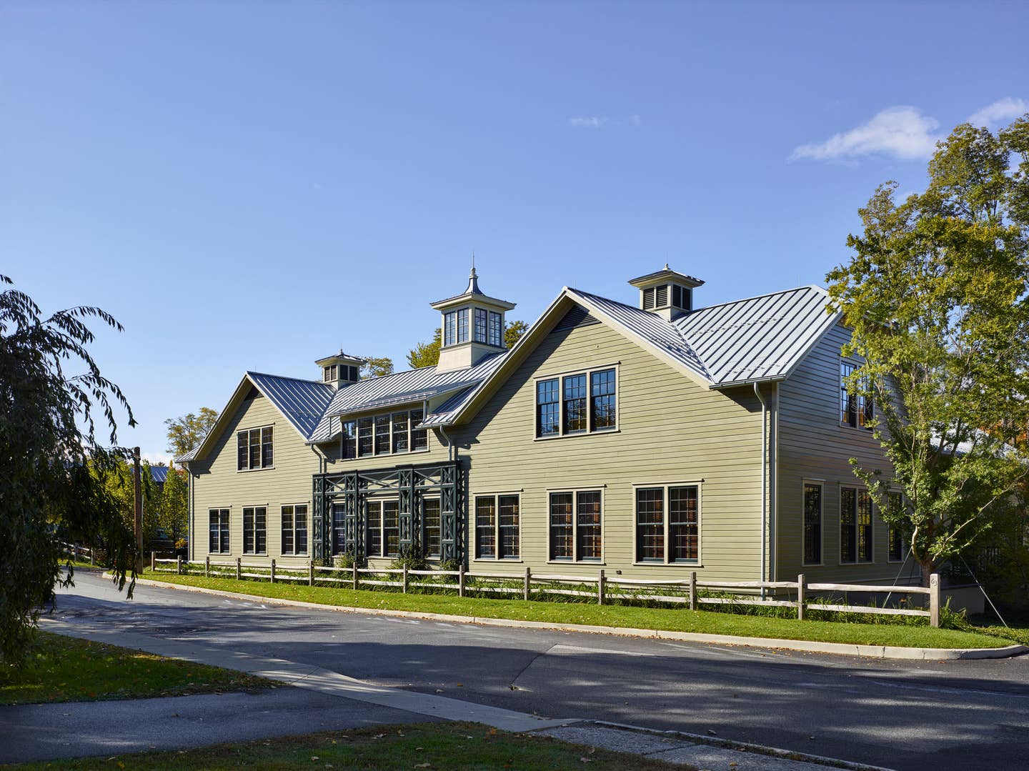
That balance between institutional and residential became the axis of a design that deftly straddles traditional building types and contexts. Thorndale Farm houses business offices for a family that has long and deep ties to The Village of Millbrook and its community, once an agricultural center that shipped produce and farm goods to New York City by rail. “The site isn’t right on the main street of the village, but off on a side street that, historically, was close to the railroad station,” explains Voith, “so in searching for appropriate inspiration, we really looked to both agricultural buildings and some railway buildings as design precedent.”
Recalls Schafer, who knew the client and their family from residential commissions, “I thought it would be interesting to make a building that connected to the family’s history, which dates to the 18th century, and their farm there, and that led me to think about giving the building a kind of agrarian character.” The client, in turn, loved the idea of relating to traditional Hudson Valley farmsteads and their own property. While that tradition includes both Federal and Greek Revival architecture, “the barns on the family farm are from the latter half of the 19th century, and even early 20th century,” says Schafer, “and that seemed a better model for the program that we had to accommodate.”
Thorndale Farm is also very much a building nurtured by the local vernacular—in fact, from structures that are within a mile or less of the site. “We drew the clipped gable roofs with a little extra kick specifically from some buildings right in the area,” says Voith, “and the same is true with the historically appropriate materials, such as the clapboard siding and the metal roof.”
Schafer agrees. “The roof of the big bar along the main street ends in clipped gables—that is, gable-ends that become hips—and that’s very much what you see in the later 19th-century barns around the community.” He adds, “There are a number of houses in the village that have little barnlike outbuildings, so we looked at that tradition as well to make sure that Thorndale Farm felt in character and in scale with this village, and didn’t overwhelm other buildings on the street.”
Designed for about 25 staff, plus executive offices, conference rooms and some open work areas, the plan of Thorndale Farm chases its tail so to speak, and for good reasons. “A big driver of the building’s program was, what might be called, an entertainment function,” explains Voith, “so the building is a big U-shape that forms a courtyard in the middle.” This, she says, allows the organization’s members to meet and have their annual or biannual board meetings comfortably, as well as give office staff a place to go outside and relax away from the commercial street. “The board room is important, and there’s also a catering kitchen.”
Schafer adds that building around a courtyard serves a less obvious but equally important function. “The building presents a public face to the town, but also has an interior, completely private face that is the outdoor room. It all connects axially from the front door, into the public reception area, and then to that outdoor courtyard.”
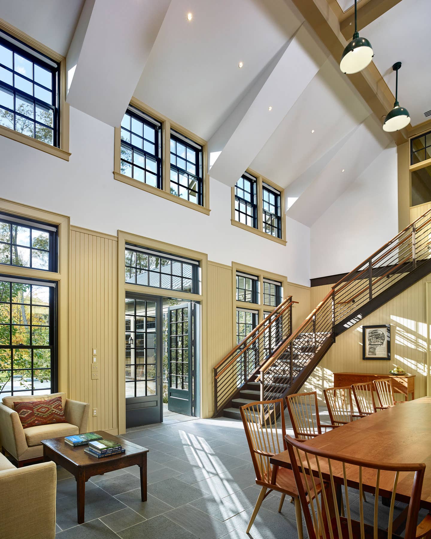
Wrapping the building around a courtyard solved a practical issue too by enabling the architects to create more walls with windows exposed to natural light. “They really wanted the building to be infused with light,” recalls Schafer, “no solid walls between offices, just glass walls, so that light permeates every space.” This directive, he says, is what guided the architects’ thinking about having as many exposures and windows as they could. “In making that courtyard, we wanted to take the biggest advantage of light as possible,” says Voith, so in making the building thin in terms of width, that natural light can really come to the center of the building, especially in the high-volume spaces.”
Windows were essential for bringing in light and creating views. “We worked hard to keep the windows in proportion,” says Voith, “and the window panes in proportion with the building, and consistent with the style.” Befitting the building’s wood architecture, traditional wood windows became a natural choice. “We used a lot of transoms,” says Schafer, “to draw your eye up and bring more sky into the spaces.” These transoms not only transmit as much light as possible, they are yet another nod to the stable buildings on the family farm where they also appear.
Voith says to reinforce that indoor/outdoor coherence, “we put flagstone paving in the courtyard, and then slate in the interior, so that when the doors are open it’s a nearly seamless connection.”
Before even considering the design issues, the architects ran into a mechanical boondoggle in the form of an existing drainage pipe. “That pipe, which starts across the street, was six feet in diameter and handled a good portion of the storm water from a section of the village,” recalls Voith. “We really couldn’t move it, because we didn’t want to replace everything under the street, so along with the owner and the civil engineers, we decided that the prudent thing to do was to enlarge the line. So, it became a challenge to rebuild the pipeline during the course of also building over it.”
The pipe, which Voith describes as “pretty much dead on-center of the building,” travels front to rear and underneath the courtyard, where it reaches light in a swale that takes any storm surge. “Part of the project was to plant in the side slope of that swale so that its side walls are really stabilized.”
The architects made architectural hay with the finishes too, and they worked with color consultant Eve Ashcraft, a longstanding Schafer associate, to develop a color palette both for the interior and the exterior. “That dark green on the sashes of the doors and windows is a nice foil for the softer sage green on the exterior,” says Schafer, “and was a nod to the colors at the farm.” He adds, “The dark muntins help them kind of de-materialize a bit as you look out,” a common practice in the 19th century, “and it was nice to carry that through to the inside as well.”
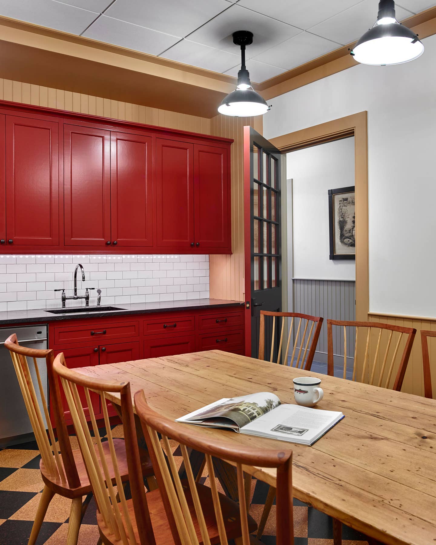
Says Voith, “The inspiration for the interior palette comes from traditional Shaker paint colors, after looking at their boxes and the kinds of paint they used, and there are some great moments of surprise.” For example, the staff kitchen, which is an iron oxide red, “might seem completely out of left field, but is really part of that whole color palette,” plus the rest rooms and the interiors of the closets have accent colors with the same source. “On the exterior, we didn’t want a jolt from the outside to the inside, so those are also Shaker inspired.”
As the architects developed the interior and the exterior—even the color palette of the interior—they studied reference material for stables and other agrarian structures. “Painting the millwork a color, but letting the drywall surfaces be a lighter, neutral, off-white, came from some of the stables we looked at,” says Schafer.
Even the zinc roof strives for a farmstead feel. “Modern standing-seam metal roofs use continuous pans from the eaves to the top of the ridge,” says Schafer. “Older buildings always had shorter runs of metal, so we wanted the alternating pan seams that you find in old barns. The running bond pattern produced by the seaming of the pans avoids the monolithic single pan and looks more authentic in terms of historic precedent; it also gives the roof texture.”
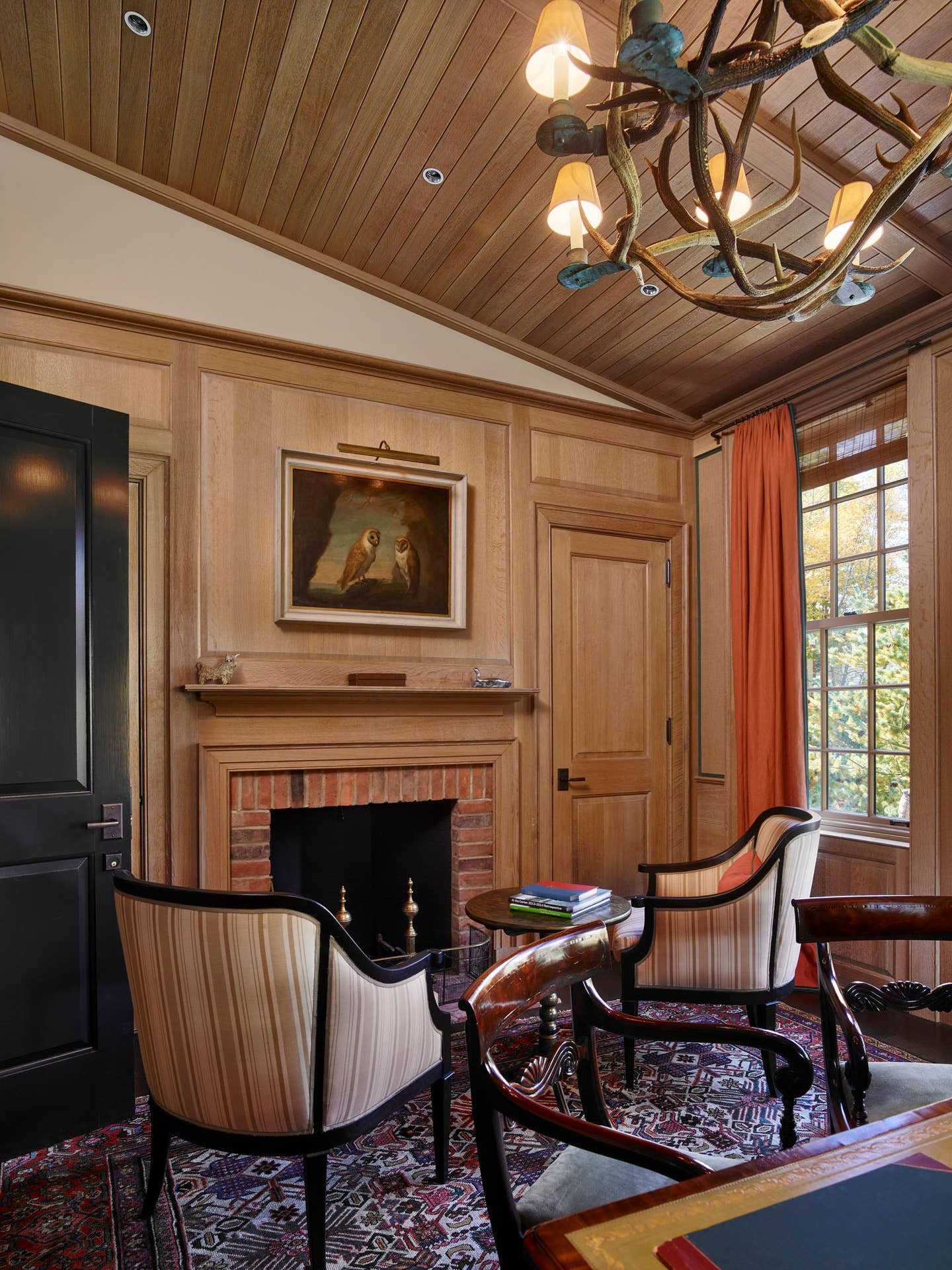
Schafer explains that they also took cues from a thoroughbred stable on the clients’ farm, which dates to the 1930s. “It has both a wood character and steel trusses, which we alluded to in our reception entry area. Then, the whole inspiration of stable architecture, with beadboard wainscoting and glass-wall partitions with true divided lights, was all a reference to buildings that exist on the family farm.” Hard to find a nicer office to get in harness.
Key Suppliers
General Contractor: Storm King Group, Montgomery, NY
Landscaping: JSK Livestock, Inc., Clinton Corners, NY
Windows & Doors: Millbrook Cabinetry & Design, Millbrook, NY; Norwood, Scoudouc, NB
Interior Sconces: Scofield Lighting, Downingtown, PA
Furniture: Thos. Moser, Auburn, ME
Conference Room Chandeliers: Circa Lighting, Savannah, GA
Interior Doors: Trustile, Denver, CO
Metal Roofing: MetalTech USA, Peachtree City, GA
Lighting: Wesco Electra Supply, Poughkeepsie, NY
Gordon Bock is an architectural historian, instructor with the National Preservation Institute (www.npi.org), and a speaker. He can be reached at www.gordonbock.com.
Gordon H. Bock is an architectural historian, instructor with the National Preservation Institute, and speaker through www.gordonbock.com.

