Features
Beacon Capital Partners & ESI Design Update Traditional Office Buildings
Historic office buildings offer a unique opportunity to update and enhance the properties in ways that respect their architecture yet transform them into state-of-the-art contemporary workplaces.
Renovations allow developers to modernize infrastructure, apply for LEED certification, create recycling programs and add amenities like lounges, rooftop decks, beehives and free Wi-Fi access without sacrificing historical accuracy. The new-old work often begins in the lobby, which is the first space tenants and visitors see, and sets the tone for the building.
Boston-based Beacon Capital Partners, which invests in high-quality office properties in core urban markets that have highly educated workforces, and New York City-based ESI Design have a long history of collaborating on such conversions to create distinct workplaces that engage tenants and the public.
Here are the stories of three traditional historic office buildings in three very different cities.
160 Federal Street, Boston, MA
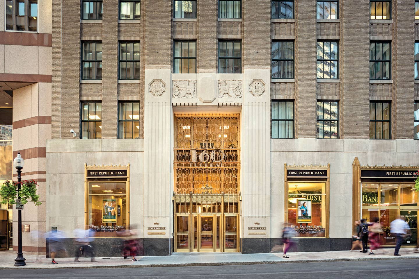
Scan the skyline of Boston’s Financial District, and it is 160 Federal Street, aka the United Shoe Machinery Corporation Building, that is most likely to catch the eye. The 24-story historic Art Deco Class-A building, built in 1929, features a stepped gold-tone and terra-cotta crown that outshines its newer neighbors, especially at night when it is illuminated like a theatre stage.
The building, at Federal and High Streets across the Rose Kennedy Greenway from South Station, is anchored by street-level retail shops and surrounded by a bevy of financial firms and institutions, including the Federal Reserve of Boston and Bank of America, as well as a number of service and technology companies.
Beacon Capital Partners had updated the infrastructure and added restaurants, on-site parking and rooftop beehives, and the building was awarded LEED Platinum certification. The improvements boosted occupancy to 92%, up from 85%. ESI Design was commissioned to add drama to the street entrance of the 367,000-sq.ft. building and bring the lobby up to date while paying homage to its historic roots.
The team started with the building’s directory, which was displayed in a bronze-molded frame built into the wall of the lobby. “We kept the frame, but we inserted a digital display to showcase dynamic media,” says ESI Design Creative Director Angela Greene. “We used a gradient glass border over the LCD display that melded the edges so it didn’t look electronic. The animations—of current weather and transportation options and the history of the building from the time it was the home of the shoe company—appear out of the dark glass like a magic 8-ball.”
The lobby’s historic elements, such as the gilded crown moldings, were refurbished. The elaborately patterned lobby carpeting, which was not original, was replaced with a custom design based on interior plasterwork and exterior grillwork. “It has a more modern feel,” says Elizabeth Ward, senior EGD designer for ESI Design.
The front desk, which was nothing more than a marble lectern, was repositioned and enlarged to accommodate new technology and provide 280-degree views to encompass the building’s three entrances. “It is circular, with Art Déco references,” Greene says. “It has a Corian surface in color tones of the original.”
A new type font, based on letters that remained on the mailboxes and elevators, was created for signage and brand identity.
To create what Greene calls “an entry moment” at the main entrance, the team turned to the exterior, which ESI Design adorned with signature images of shoes. “We embedded brass shoe prints—a men’s set and a women’s set—in the sidewalk at each entrance,” Ward says. “It is a nod to the building’s heritage, and we worked with Boston’s Landmark Commission to have it approved as an artistic addition.”
The most dramatic change in the lobby is the lighting. “What was there was harsh and unpleasant,” Greene says. ESI Design re-lamped the original chandeliers with LED lights and uplighted them to highlight the ceiling medallions and crown molding. In addition, at the entryways, it surrounded the brass door frames with LED lights and added uplighted LED bars. The elevator call system was also re-lamped using the original casings.
All of these elements, Greene says, create an “experiential makeover. The lobby feels like a place where people want to spend time. It reflects the history of the building, but it also modernizes the space.”
160 Federal Street Project Partners
Experience Design: ESI Design, New York City
Architect of Record: Nelson Architects, New York City
Fabricator: DCL (Design Communications Ltd.), Boston
Systems Integration: Diversified, Kenilworth, NJ
Software Developer: AV&C, New York City
General Contractor: MJA Construction, Medford, MA
Lighting Design: Available Light, Boston, MA
Historic Lighting Fixture Replacement: Custom Metalcraft, East Taunton, MA
Exchange Building, Seattle, WA
Seattle’s Exchange Building, a 23-story, 275-ft.-high Art Deco skyscraper that was declared a city landmark in 1990, is the original home of the Seattle Stock Exchange. Completed in 1930, it was designed by John Graham & Associates, the firm responsible for a host of other Seattle landmarks, including the Frederick & Nelson Building, which is now Nordstrom, the Bon Marche, which became Macy’s, and the Dexter Horton Building.
Its original tenants, which included General Electric, Edison Lamp Works and Standard Oil, were as iconic as the building, which, at the time, held the title of second tallest reinforced concrete skyscraper in the country.
When ESI Design was called upon to work on the project, Beacon Capital Partners had already transformed the building into a Class-A property by modernizing the infrastructure, including a voluntary seismic retrofit, improving its sustainability, optimizing its connectivity and adding a host of amenities, including a fitness center, a bike-storage space and rooftop beehives.
The ESI Design team focused on the main entrances—one on 1st Avenue and a grander one on 2nd Avenue—that are four floors apart. “Seattle has very steep hills,” Ward says, “and the public often uses the building’s elevators as a shortcut.”
In each lobby, ESI Design inserted electronic media into the vintage directory frames, relocating the one in the 1st Avenue space, moving it nearby the elevator bays to make it more prominent.
It also created a custom vintage-style font for signage, elevator numbers and amenity spaces, including the gym, bike-storage room and conference center.
A new identity logo was installed on an exterior lobby canopy at 1st Avenue and illuminated with LED lights. The new ID also was embedded in a new terrazzo floor in the 2nd Avenue space after its white tiles, which were not original, were removed.
The interiors of the elevators were redone in an up-to-date historic style, and the desks in the lobbies, which were not original, were redesigned. “The desks are always a big issue in these types of projects,” Ward says. “They don’t accommodate computers or technology, and they don’t function well enough for the guards to do their jobs efficiently or effectively.” For the 2nd Avenue lobby, the ESI Design team created a more efficient desk with a striking brass veneer that has plenty of space to accommodate modern technology and packages.
The most dramatic transformation was in the 2nd Avenue lobby, where the circa 1990s wood paneling behind the front desk was removed and replaced with glass. “When Beacon brought us into the project, it had been decided to turn that area back into a tenant space,” Ward says. “We created a modern diamond-shaped diffusion pattern inspired by Art Deco designs to make the space more private and to allow natural light to flow into the lobby.”
Innovative lighting helped bring the lobbies back in time: The wall clocks were illuminated, and the stained-glass panels above the doors, barely visible, were highlighted with LED lights.
The new building branding and ID were extended to the signage of the retail shops around the lobbies. “We created a consistent signage band across the top of the storefronts,” Ward says. “All the tenants are using the same font, and we created color, fabrication and retail signage guidelines for them.”
After the renovation, the building was awarded LEED Platinum certification and was named BOMA’s Outstanding Building of the Year in the Historic Building Category in 2016. Occupancy increased nearly 30%, and many of the new tenants are from the creative and technology fields.
Exchange Building Partners
Experience Design: ESI Design, New York City
Architect of Record: JPC Architects, Bellevue, WA
Systems Integration: Diversified, Kenilworth, New Jersey
Software Developer: AV&C, New York City
Signage: Trade Marx, Seattle, WA
Lighting Design: Stantec, Seattle, WA
General Contractor: HST Construction, Bellevue, WA
Power + Light Building, Portland, OR
For more than three decades, the Public Service Building reigned over the Portland skyline as the tallest structure in The City of Roses. It announced its stature and its purpose from four neon signs—POWER, HEAT, GAS and LIGHT—atop its roof.
The 15-story Italian Renaissance-style terra-cotta and gray brick building at Salmon and Sixth Streets, which opened in 1928 and was added to the National Register of Historic Places in 1996, was designed by local architect A.E. Doyle, whose firm worked on two others, the 1924 Bank of California Building and the 1926 Pacific Building, in the city.
Architecture aside, it was an important building: The city’s main power plant was originally in its basement, and it still houses the city’s main power feeds. Although it lost its sky-high bragging rights in 1962 when the Hilton Portland Hotel bested it by all of nine feet, the one-time home of the first Niketown store is the largest block of contiguous office space in the city’s Central Business District.
The project, which is expected to be completed in 2018, began with a large-scale renovation by Beacon Capital Partners, which has applied for LEED Gold certification. The ESI Design team exploited the building’s rich history to rebrand it and rename it the Power + Light Building, which has an energetic, contemporary ring.
“We took the two most positive words—power and light—from those once-existing rooftop signs that we saw in vintage black-and-white photos,” says Matt Weisgerber, ESI Design senior physical designer. “And we built branding around the theme of the plus and minus charge signs of a battery.” Thus, the building’s logo, and the carpeting, clock and mezzanine railing in the lobby make use of those simple symbols.
The reception desk, which was from a 1980s remodeling, will be modernized and given a bronze finish to complement the honey-color marble on the wall. “The space felt very monochrome,” Greene says, “so we will use pops of color on the upholstery of the furniture. We also added an eight-seat co-working table, which is something everyone is asking for, that has an industrial base and walnut top.”
Updated lighting brought the lobby to life. The ESI Design team removed a series of ill-placed pendants (one was blocking the view of the original clock on the elevator wall) of seesawing heights and designed two new bronze ones and added cove lighting to create a focal point.
“The lighting will make a big difference,” Weisgerber says. “People will notice the lightbox effect from the outside, and it will elevate the space.”
Power + Light Partners
Experience Design: ESI Design, New York City
Architect of Record: TVA Architects, Portland, Oregon
General Contractor: Lease Crutcher Lewis, Portland, Oregon
Specialty Fabricator and Signage: CREO Industrial Arts, Woodinville, Washington
Lighting Design: Stantec, Seattle, Washington
Land-Use Attorney: Radler White, Portland, Oregon


